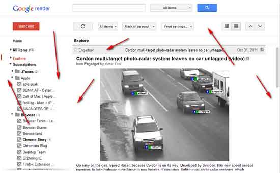
Just like any other Google product, Google Reader has also just received a major makeover. Now it has a clean new look with more space and less clutter making it easier to use and navigate feeds. In addition, the integration of Google + lets users gives a +1 to any item and share with their circle. Here is how to give an even better UI to your new Google Reader.
To make your new Google Reader even better, here is a Chrome extension called New Google Reader Rectifier. It can fix some of the design issue of the new Google Reader’s layout.
Once installed, the New Google Reader Rectifier extension removes unnecessary white space and gaps, adds a border to the content to separate it from the interface, and leaves you with a pleasant condensed UI.
Interested users can download New Google Reader Rectifier from Chrome Web Store.


