Opera to Make a Sleeker, User-friendly Browser
The recent browser market trend shows that major browser developers are inclined to make their browser sleek and user-friendly with minimal design interface. It was Google Chrome first introduce the minimal design, followed by Firefox 4 and Internet Explorer 9. Now Opera has also on the same way.
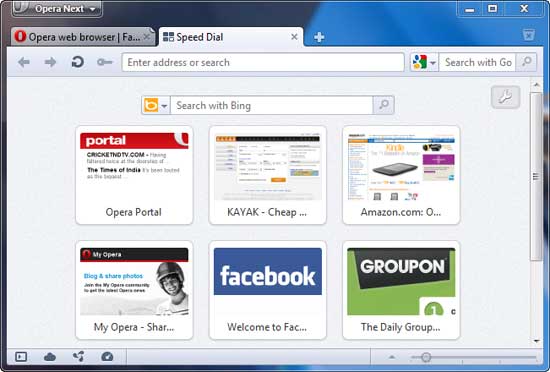
The latest test build of Opera Featherweight (11.5 beta) has got some facelift from its previous build. Some changes are highly visible, such as the address and status bars, but Opera reworked much of the skin throughout—including a brand new icon set.
According to a blog post by Opera, the company’s goal has been to “make Opera as light, bright, and user-friendly as possible—without sacrificing power or flexibility…and want the user interface to match the speed of our rendering engine”.
Highlights of the new test build called Opera Next:
- Brand new toolbar icon set
- Brighter, softer colors for backgrounds and borders
- Padding and alignment improvements
- Updated status bar design and content
- No more button borders in the address bar
- The Home and Fast Forward buttons now optional
- New “tab fold” attention state – no more blue blob [via]
You can download the test build from here
Comments (1)
Comments are closed.


I have moved over firefox and its only chrome and opera which matters next ! Good news opera is getting more awesome .
Thanks for the share 🙂